KEE

Unlock your
wellness.

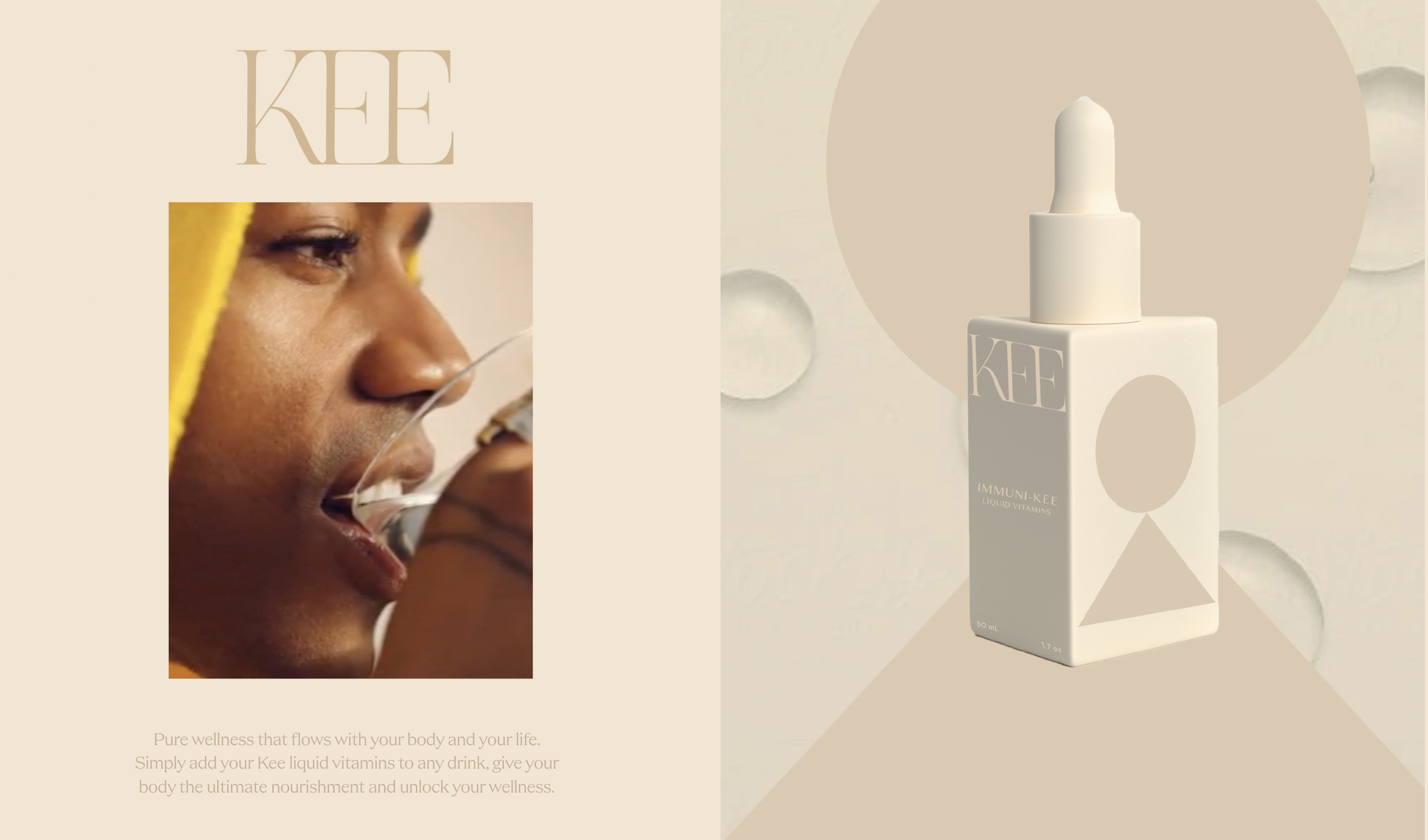
Taking care of your health shouldn't mean choking down handfuls of chunky, clunky pills every day. Kee creates a better way to thrive: Pure wellness that flows with your body and your life. Our liquid vitamins streamline your regimen and bring you more bioavailable benefits-without any mystery ingredients, additives or filler. Easier for your body to use, liquid vitamins powerfully deliver nutrients for radiant skin health, elevated immunity, increased energy, stress support and whole body wellness-completely fuss free. Simply add your Kee liquid vitamins to any drink, give your body the ultimate nourishment and unlock your wellness.


Kee-4
THE KEY TO PURE WELLNESS

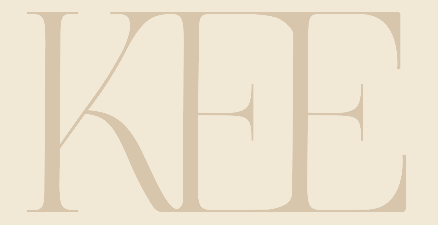
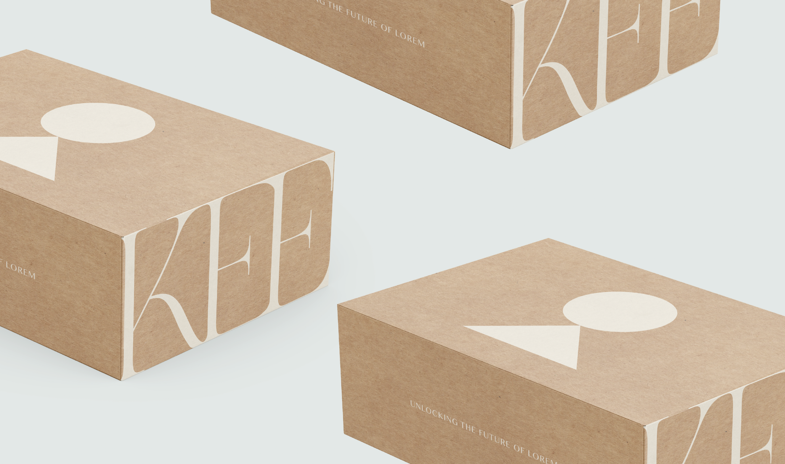
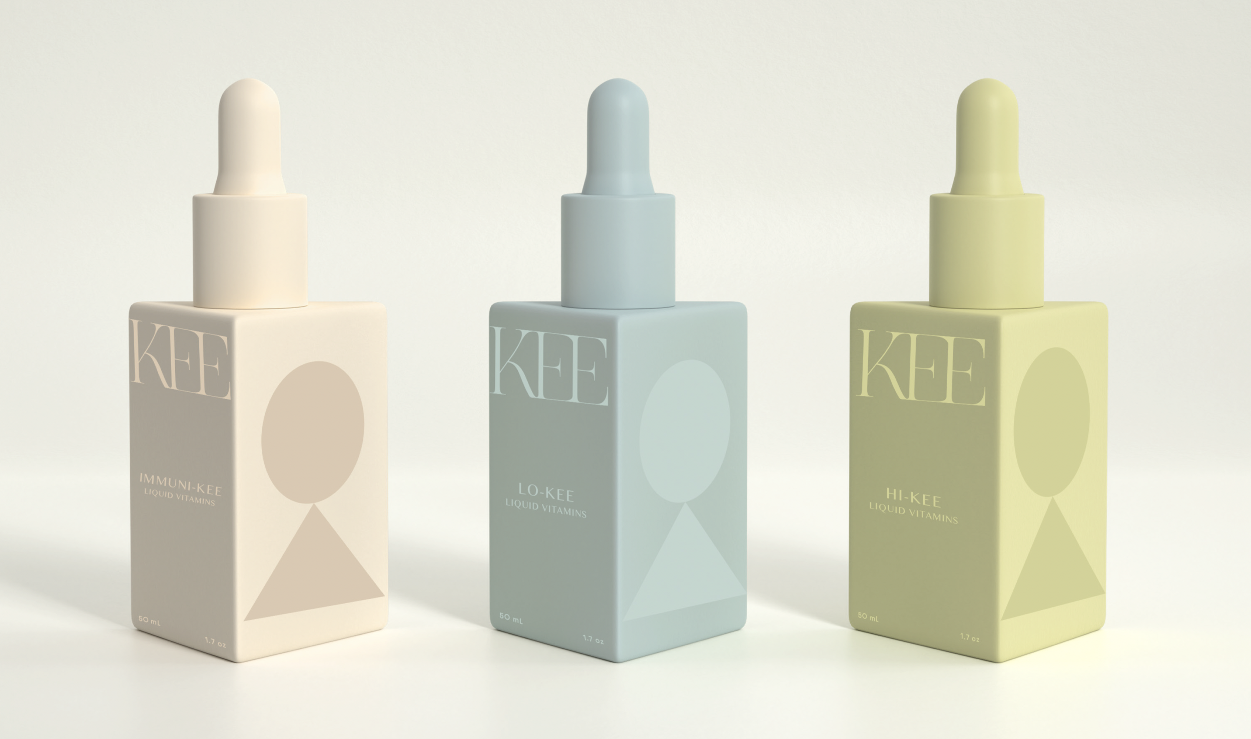
The logotype has a flowing, interconnected quality which speaks to the liquid form of the vitamins while the submark and graphic element represent an abstracted keyhole—speaking to unlocking wellness while also striking a balanced lifestyle.

Screenshot-2023-07-27-at-2.59.30-PM-1
Kee-3
Screenshot-2023-07-27-at-3.02.58-PM
Screenshot-2023-07-27-at-3.00.28-PM-1


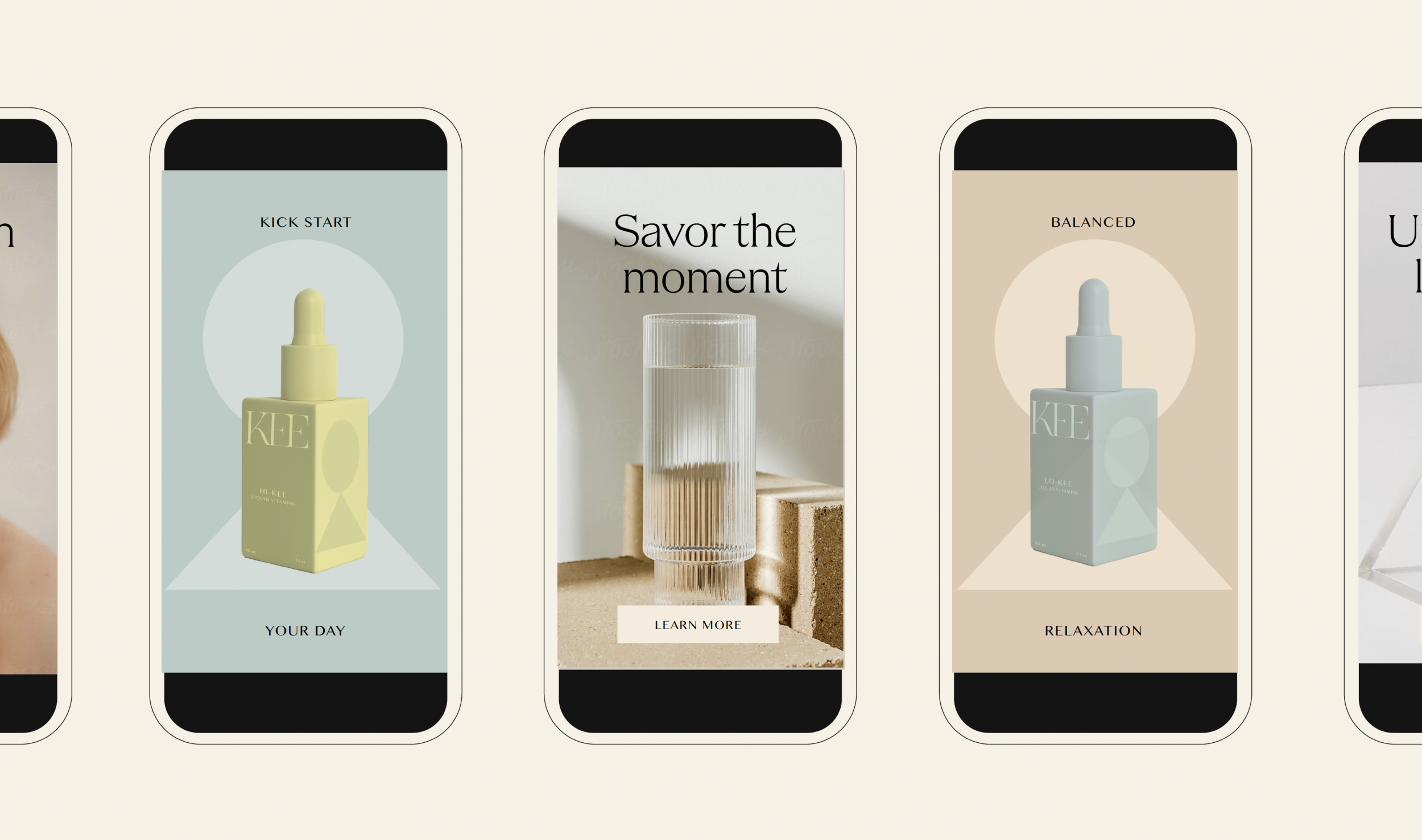
There's a flow to life, and the key is to flow with it. In your full energy, balance and beauty. By giving your body what it needs to thrive. Kee's liquid vitamins work better for your body to unlock your best health, more quickly and effectively which is what inspired the visual simplicity, liquid textures, and balanced brand identity.

Kee-7
WITHOUT THE BAGGAGE

We're making that daily pill organizer a thing of the past. Easier for your body to absorb quickly, liquid vitamins deliver the maximum bioavailable nutrients for skin health, immunity, stress relief and energy, without the baggage and Kee needed a brand identity that felt intentional, smart, and without all the frills and overdesigned vitamins we see on the shelves. The identity is based on utilizing only the most essential elements the brand needs—nothing more.

The modular and flexible system extends to applications such as signage, ads, mechandise, and social media, while the vibrant and playful color palette insert a warmth and approachability that mirrors the core values of an always free and open (to the public) museum.
Kee-6


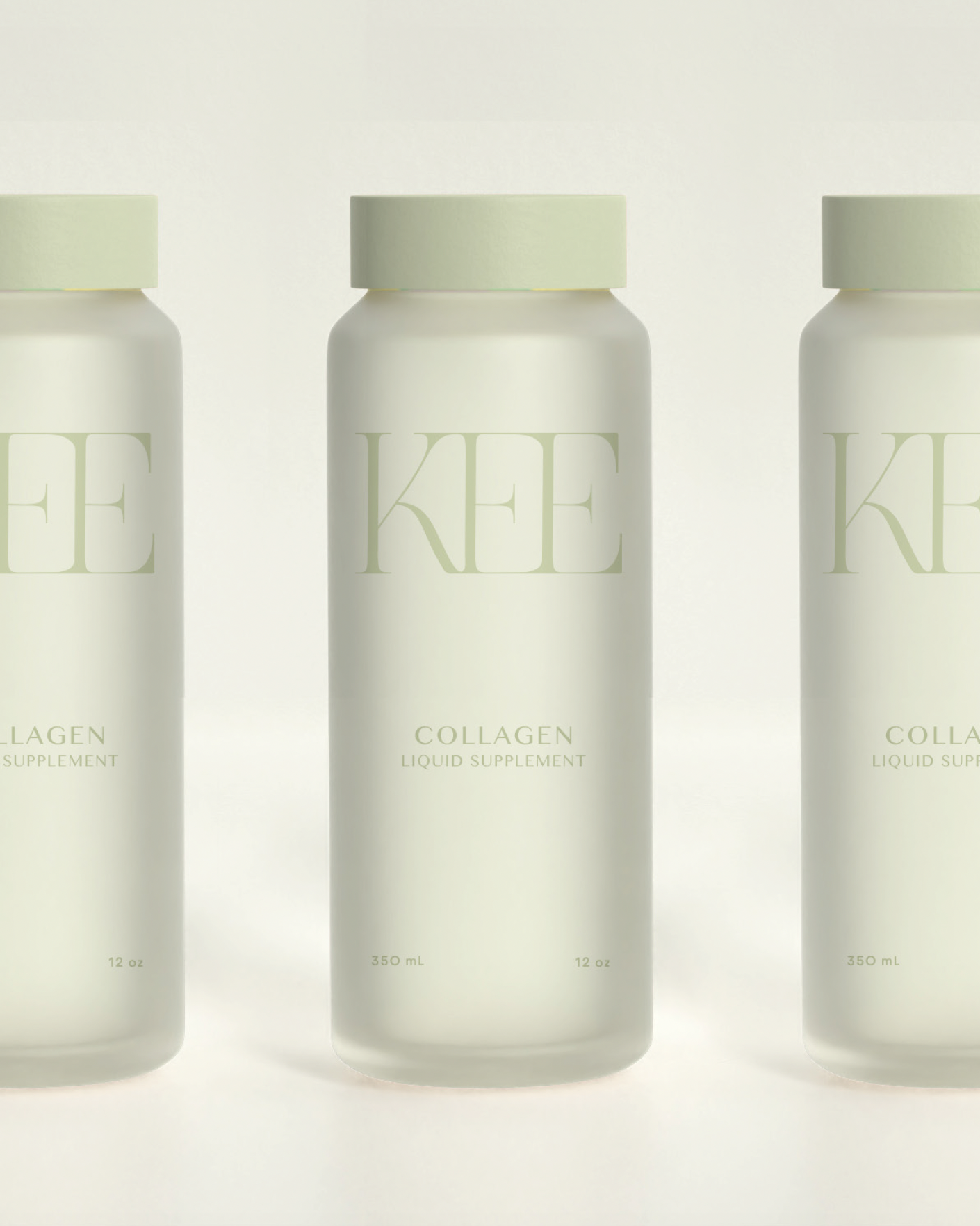
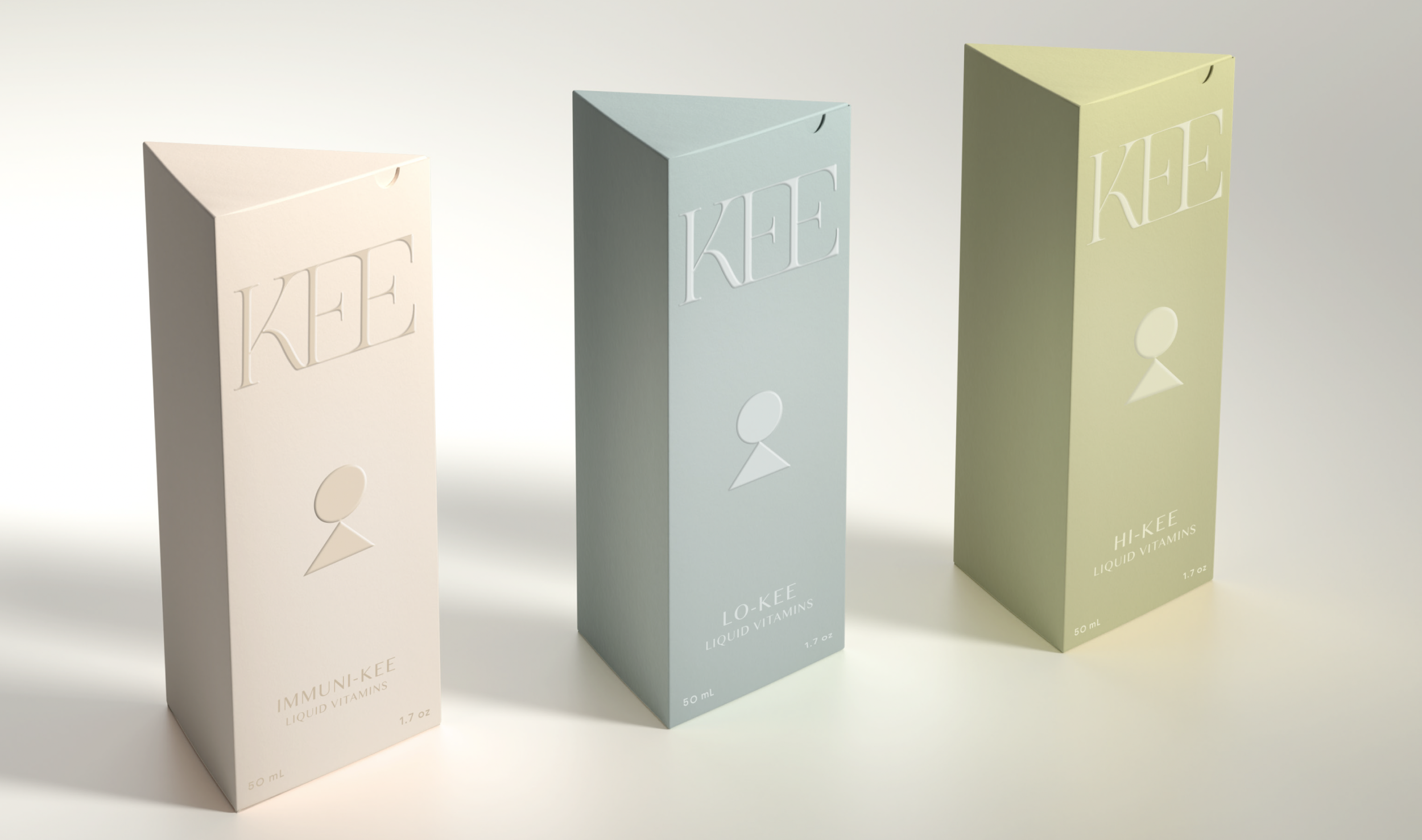
The custom triangular packaging further reflects the unexpected essential shapes coming together while the soft monochromatic color palette feels approachable and soothing, evoking a warm welcome. Textural liquid imagery adds a touch of sensory interest to the suite while nicely contrasting the clean geometric shapes. Dynamic, layered imagery and minimal typographic messaging nicely balance each other, conveying the streamlined wellness that flows with your body.

Kee-10
DISCOVERY
STRATEGY

BRANDING
PACKAGING

PRINT
ART DIRECTION
View